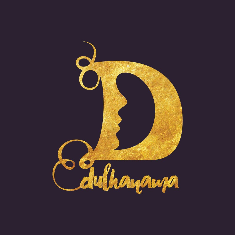
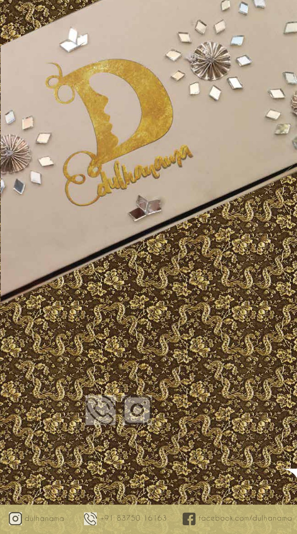
A gold lettermark for a bridal-jewellery label — a bride's profile cut from the negative space of the "D" — extended to a trifold brochure on a cream-and-gold lattice. The identity and collateral are mine; the jewellery is the label's own.
Dulhanama is a bridal-jewellery label. The brief was a mark with the warmth of the occasion, and the answer is a single gold lettermark — a "D" whose inner counter is carved into the profile of a bride, her face and the letter drawn as one, with a flourished script wordmark beneath.
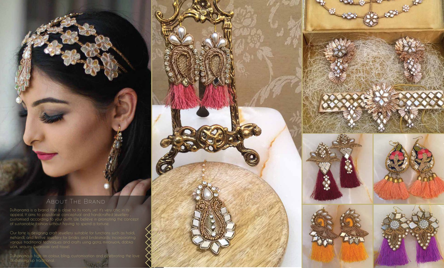
From that mark the work extends to a trifold brochure. The jewellery photographed inside belongs to the label; the identity and the collateral are the design here.
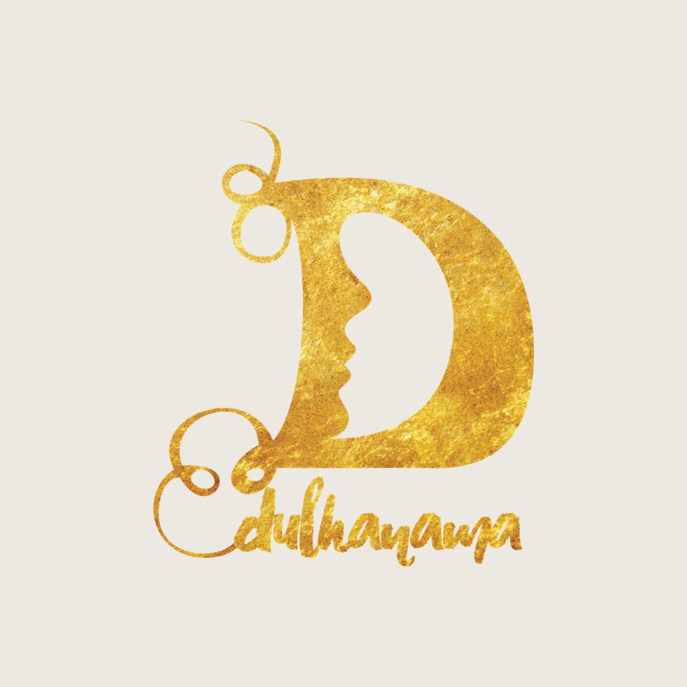
The letter and the bride, one drawing.
The counter of the "D" is shaped into a woman's profile — forehead, nose, lips, the fall of an earring — so the negative space of the letter becomes the subject. Rendered in gold leaf, it reads first as an initial and then, a beat later, as a face. The script "dulhanama" curls beneath to soften the geometry.
The trifold carries the mark onto a ground of cream and gold lattice, with an "About the Brand" panel and the collection laid across the inner spread. Throughout, the jewellery shown is the label's own product — the design contribution is the mark, the layout and the typographic system.